
In a previous post, I introduced RShiny and highlighted a project to visualize Australian hospital data. If you read my previous post, I compared RShiny to Tableau, an extremely popular enterprise data visualization tool. I have used Tableau extensively to build metric dashboards, or easy to read dashboards that visualize and summarize KPIs for a particular department or business unit in the UCSD healthcare system. With this in mind, I set out to learn if RShiny was capable of creating similar metric dashboards. I’m excited to say that the answer is yes!
In this blog post, I will explore the Shiny Dashboard package with a simple use case : visualizing Medicare claim data made available here. As you will see, the Shiny Dashboard package makes it extremely easy to create metric dashboards.
Shiny Dashboard
A shiny dashboard consists of three main areas : 1) Header 2) Sidebar 3) Body. You can think of the header as the title of the dashboard, the sidebar as the navigation links or filters to the side, and the body as where the main components of the dashboard will go. Shiny dashboard also makes it easy to create multiple tabs per dashboard, where different visualizations can be displayed. Setting up a basic dashboard is quick and easy, and I recommend checking out the link to the documenation above for further detail
UI Code
The UI code for this dashboard is shared below :
dashboardPage(

    dashboardHeader(title = "Healthcare Costs"),

    dashboardSidebar(

      #put in DRG lookup
      pickerInput(
        inputId = 'drg_input', label = 'Search for DRG below:', choices = levels(data$DRG.Definition),
        options = list(`actions-box` = TRUE),multiple = T,selected = levels(data$DRG.Definition)
      ),

      #put in State lookup
      pickerInput(
        inputId = 'state_input', label = 'Search for State below:', choices = levels(data$Provider.State),
        options = list(`actions-box` = TRUE),multiple = T,selected = levels(data$Provider.State)
      )),

    dashboardBody(

      fluidRow(

      #put in 5 "metric boxes"

      #number of discharges
      valueBoxOutput("num_dc_Box",width=2),

      #average covered charges
      valueBoxOutput("avg_charge_Box",width=2),

      #median covered charges
      valueBoxOutput("median_charge_Box",width=2),

      #standard deviation
      valueBoxOutput("sd_charge_Box",width=2),

      #IQR
      valueBoxOutput("iqr_charge_Box",width=2)
      ),

      #put in histogram
      fluidRow(
        box(plotOutput("hist", height = 500)),
        box(plotOutput("bar_chart",height = 500))
      )
   )
)
The three dashboard areas (header, sidebar, and body) are clearly seen above. In this case, I name the dashboard a simple “Healthcare Costs”. I also put my two filter options, DRG and State, in the sidebar. Finally, the body of the dashboard contains five metric tiles in one row, and two graphs in the second row. Note that in Shiny Dashboard, valueBoxOutput() is used to create the sleek metric tiles. The metrics and graphs will be rendered and defined in the server code below.
Server Code
The server code for this app is shared below :
server <- function(input, output) {

  #filter based on inputs
  data_subset <- reactive({
    filter(data,DRG.Definition == input$drg_input & Provider.State == input$state_input)
  })

  #create metric boxes
  output$num_dc_Box <- renderValueBox({
    valueBox(
      sum(data_subset()$Total.Discharges), "Number of Discharges",
      color = "blue",icon = icon("user-check")
    )
  })

  output$avg_charge_Box <- renderValueBox({
    valueBox(
      paste('$',formatC(mean(data_subset()$Average.Covered.Charges),digits = 2,big.mark=',',format = 'f')), "Average Charges",
      color = "red"
    )
  })

  output$median_charge_Box <- renderValueBox({
    valueBox(
      paste('$',formatC(median(data_subset()$Average.Covered.Charges),digits = 2,big.mark=',',format = 'f')), "Median Charges",
      color = "green"
    )
  })

  output$sd_charge_Box <- renderValueBox({
    valueBox(
      paste('$',formatC(sd(data_subset()$Average.Covered.Charges),digits = 2,big.mark=',',format = 'f')), "Standard Deviation Charges",
      color = "yellow"
    )
  })

  output$iqr_charge_Box <- renderValueBox({
    valueBox(
      paste('$',formatC(IQR(data_subset()$Average.Covered.Charges),digits = 2,big.mark=',',format = 'f')), "IQR Charges",
      color = "orange"
    )
  })
  #create histogram of charges

  output$hist <- renderPlot({

    # Render the plot
    ggplot(data_subset(), aes(x=Average.Covered.Charges)) + geom_histogram()
  })

#create bar chart of state differences

output$bar_chart <- renderPlot({

  # Render the plot
  ggplot(data_subset(), aes(x=Provider.State,y=Average.Covered.Charges)) + stat_summary(fun = "mean", geom = "bar")
  })
}
Above, the data is first filtered based on the user inputs in the filters from the ui code. Once the data is filtered, the values for the metric tiles can be created (number of discharges, mean, median, standard deviation, and IQR). Also, the histogram and bar chart are creared to explore the distribution of charges and difference of mean charges across the selected states.
Screenshots of App
Here is a final screenshot of the app when run out of R :
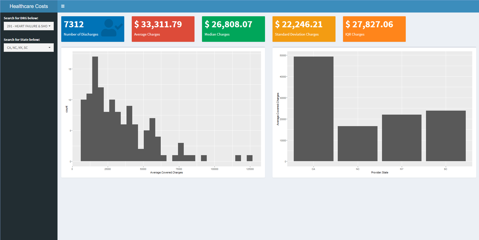
I filtered on the three heart failure DRGs and all of the states I have lived in. It’s quite interesting to observe how much higher CA is when compared to the other states, especially when compared to NY!
Conclusions
Shiny Dashboard is a really flexible package that makes it quite easy to quickly develop dashboards. As seen above, a few hours of development time resulted in a simple, yet powerful dashboard that clearly visualizes KPIs. I can imagine plenty of use cases for shiny dashboards in a production environment, especially when a software like Tableau is out of the question due to costs and other factors. I will continue to explore the power of RShiny and hope to share more cool projects in the future! Thanks for reading.