I have extensive experience in the development of healthcare dashboards. My position at UC San Diego Health began with tedious, manual updates of enormous, complex Excel dashboards. Luckily, the bulk of my dashboarding is done in Tableau now. Tableau offers an easy way to create attractive, automated dashboards that decision makers love to use. While Tableau is amazing at certain things, it still leaves a lot to be desired. Namely, it doesn’t offer great functionality to incorporate custom, statistical analysis into user facing dashboards. Therefore, I was really excited to learn more about R Shiny during my courses this past term.
This blog post will summarize my final term project and give a basic explanation of how R Shiny apps work. One note, I will only include the code for one tab of the entire app. The entire script for this project can be found on my Github.
The Basics
Shiny is an R package that is used to create interactive web applications straight from the R statistical software. A Shiny app is contained in a single script called app.r. The script has three main components : 1) A user interface object (UI) 2) A server function 3) a call to the shinyapp function.
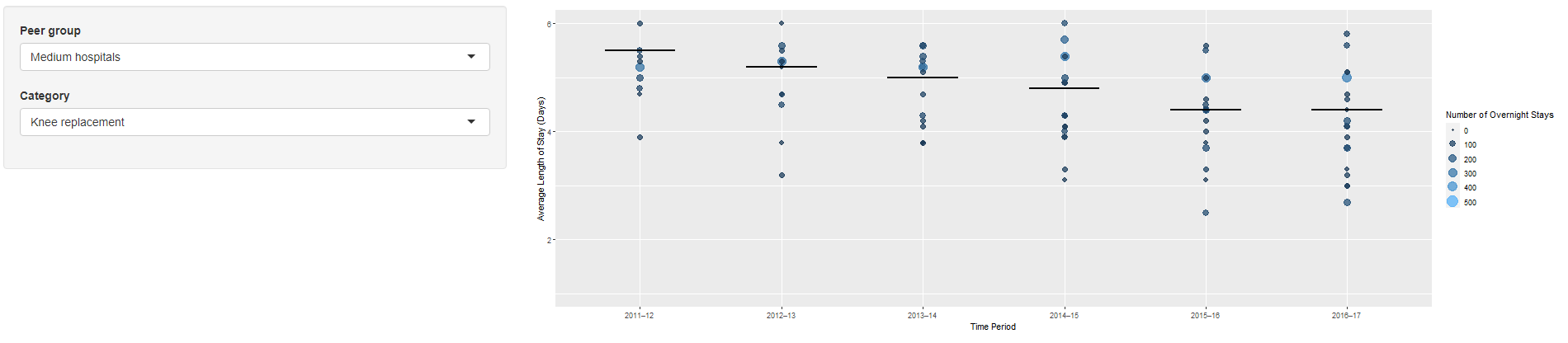
For this dashboard, I will be using a dataset that contains length of stay summary information for Australian hospitals. I will be building a dashboard that contains the following :
- Plot with Average Length of Stay (ALOS) on Y-axis and Time Period on X-axis
- Point for each hospital, with number of overnight stays controlling the size and color of each point
- A reference line in each time period for peer ALOS comparison
- Filterable by Peer Group (Hospital Type) and Category (diagnosis/procedure).
UI Code
The UI object controls the layout and appearance of the app. The UI code for this app is shared below :
ui <- fluidPage(

     sidebarLayout(
        sidebarPanel(

         #input for Peer Group
         selectInput(inputId = "Task3.peer_group", label = "Peer group",
                      choices = levels(hosp_los$Peer.group),
                      selected = "Medium hospitals"),
         #input for Category
         selectInput(inputId = "Task3.category", label = "Category",
                      choices = levels(hosp_los$Category),
                      selected = "Knee replacement")),

      mainPanel(
          #insert the plot
          plotOutput("ALOS_plot")
          )))
The code is fairly simple. I define the filter options (selectInput) and place them under the sidebarPanel. In the mainPanel, I simply insert the plotOutput object that will be created in the server code.
Server Code
The server function contains the instructions to build the app. The server code for this app is shared below :
server <- function(input, output) {

# Subset input data into new dataframe
  hosp_los_subset <- reactive({
    filter(hosp_los,Peer.group == input$Task3.peer_group & Category== input$Task3.category)
  })

  output$ALOS_plot <- renderPlot({

    # Render the plot
    ggplot(hosp_los_subset(), aes(x=as.factor(Time.period), y=Average.length.of.stay..days.)) +
      #plot points and size
      geom_point(aes(size = Number.of.overnight.stays,colour=Number.of.overnight.stays),alpha=.75,na.rm=TRUE) +
      #add lines for peer group average
      geom_segment(aes(x=as.integer(Time.period)-.25,xend=as.integer(Time.period)+.25,
                       y = Peer.group.average..days.,yend = Peer.group.average..days.),size=.75,na.rm=TRUE) +
      #set scale for size
      scale_size_continuous(limits=c(0,500),breaks=seq(0,500,by=100),name ="Number of Overnight Stays") +
      #set scale for colour
      scale_colour_continuous(limits=c(0,500),breaks=seq(0,500,by=100),name ="Number of Overnight Stays") +
      #combine legends into single legend
      guides(colour=guide_legend(), size = guide_legend()) +
      #set x label
      xlab("Time Period") +
      #set y label
      ylab("Average Length of Stay (Days)") +
      #set y limits
      ylim(1,6)
  })
}
Note, the two different functions reactive() and renderPlot(). These are called reactive functions and will be called any time an input within them changes. Therefore, the data will be subset and the plot will be re-calculated and drawn whenever one of the filters change. I won’t go into any specific details for the ggplot, feel free to reach out if you have questions about the code.
Screenshots of App
Here is a final screenshot of the app when run out of R :
From here, there are multiple deployment options avaiable. This app was not deployed beyond my computer, so I will save that process for a future blog post.
Conclusions
I’m extremely excited to continue exploring and working on R Shiny apps. The customization and flexibility is amazing, and I recommend anyone interested to explore the R Shiny Gallery. I hope to build another app very soon, and will be sure to share in a future blog post!